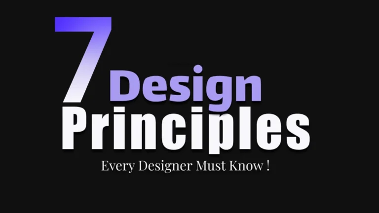
What Are the 7 Principles of Graphic Design?
Graphic design principles are the core guidelines that help designers create visuals that are both beautiful and effective. Whether you are working on a brand logo, a website layout, a poster, or a social media graphic, these seven principles apply to every project.
Think of them as the grammar of visual language. Just as grammar helps you write clear sentences, professional design principles help you build clear, impactful visuals.
Here are the 7 Principles of Graphic Design we will cover:
- Balance
- Contrast
- Visual Hierarchy
- Alignment
- Repetition
- White Space
- Typography & Composition
Balance in graphic design means distributing visual elements so the design feels stable and comfortable to the eye. Just like a physical scale, a balanced layout creates a sense of order and trust.
There are two main types of balance:
- Symmetrical balance — equal elements on both sides of the design. It feels formal, clean, and professional. Great for corporate branding design tips.
- Asymmetrical balance — different elements that still feel visually even. It adds energy and is popular in modern graphic design tips and editorial layouts.
For example, a logo with a large image on the left and bold text on the right uses asymmetrical balance — both sides feel "weighty" even though they look different. This is one of the most important layout design techniques you will use as a designer.
Contrast in graphic design is about making elements stand out from each other. It draws attention, creates visual interest, and makes your message instantly clear. Without contrast, everything looks flat and boring.
Contrast works in many ways:
- Colour contrast — dark text on a light background (or vice versa)
- Size contrast — a large headline next to small body text
- Shape contrast — a circle among squares
- Weight contrast — bold fonts beside thin fonts
Strong contrast is one of the most powerful creative graphic design ideas you can use. It guides the viewer's eye and makes key information pop. In branding design tips, contrast is often used to make a call-to-action button impossible to miss.
Visual hierarchy design tells your viewer where to look first, second, and third. It organises information so the most important content is seen immediately and the rest follows naturally.
Without visual hierarchy, a design feels chaotic — the eye does not know where to go. With it, you guide the viewer through your message like a story.
You can create strong visual hierarchy using:
- Size — larger elements attract attention first
- Colour — bright or bold colours stand out against neutral ones
- Position — the top of a design is viewed first in most cultures
- Font weight — headlines vs body text establish a reading order
This is one of the most important graphic design principles for websites, posters, and social media graphics. It connects directly with typography and composition, which we will cover in principle seven.
Alignment in graphic design means placing elements so they line up with each other, creating a clean and organised look. Nothing says "amateur" faster than randomly placed text and images that do not align.
Alignment creates invisible lines that tie your design together. Even when elements are far apart on the page, consistent alignment makes them feel connected and intentional.
Common types of alignment include:
- Left alignment — clean and easy to read, great for body text
- Centre alignment — formal and symmetrical, perfect for headings
- Right alignment — less common, used for creative graphic design ideas and accents
- Grid alignment — the backbone of all serious layout design techniques
The repetition design principle means using the same visual elements (colours, fonts, shapes, icons) consistently throughout your design. Repetition creates unity, builds brand recognition, and makes your work look polished and professional.
This is one of the most overlooked graphic design principles, yet it is central to all branding design tips. Think about how brands like Apple or Nike use the same fonts, colours, and spacing across everything — that consistency is repetition at work.
In a single design piece, repetition might mean:
- Using the same accent colour for all buttons and highlights
- Using the same font for all headings
- Repeating an icon style or shape throughout a layout
- Keeping the same spacing between sections
For a beginner graphic design guide, this is the principle that makes your work look consistent without much effort. Build a small style guide with your chosen colours, fonts, and shapes — then use them everywhere.
White space in graphic design (also called negative space) is the empty area around and between design elements. Many beginners think white space is "wasted" space. In fact, it is one of the most powerful tools in design.
White space does three important things:
- It improves readability — text and images with breathing room are easier to read and understand
- It creates focus — by removing clutter, white space draws the eye to what matters most
- It communicates quality — luxury brands use generous white space to signal premium value
White space is not always white — it is simply the empty, unoccupied space in a design. It can be any colour, pattern, or background. This principle is essential in both typography and composition and in layout design techniques.
The final and often most expressive of the 7 Principles of Graphic Design is typography and composition. Typography is the art of arranging text — choosing fonts, sizes, spacing, and layout to communicate effectively. Composition is how all elements are arranged within the frame.
Great typography does more than make text readable. It sets the mood, reinforces the brand, and guides the viewer's emotions. This is why font choice is one of the first decisions in any branding project.
Typography Basics for Beginners
- Choose no more than 2–3 fonts per design to maintain clarity
- Use font hierarchy — a large headline, a medium subheading, small body text
- Line spacing (leading) — give your text room to breathe
- Letter spacing (tracking) — small adjustments create big differences in feel
Composition Tips
- Use the rule of thirds to place focal points naturally
- Create a clear visual hierarchy design within your layout
- Balance text and image areas thoughtfully
- Leave enough white space around text blocks for comfort
Strong composition brings together all the other graphic design principles — balance, contrast, alignment, repetition, and white space — into a cohesive, memorable final piece. This is the hallmark of a truly professional design principle in action.
Applying the 7 Principles of Graphic Design in Real Projects
Understanding each principle is just the beginning. The real skill — and the real joy — of graphic design is using all seven together, naturally and intuitively. Here is a quick checklist you can use before finalising any design project:
- Does my design feel visually balanced — left to right, top to bottom?
- Is there enough contrast to make key elements stand out?
- Does my layout have a clear visual hierarchy — a natural reading order?
- Are all elements aligned to a consistent grid or axis?
- Have I used colours, fonts, and shapes consistently (repetition)?
- Is there enough white space so the design does not feel crowded?
- Does my typography support the message and set the right tone?
Modern Graphic Design Tips for 2025
Design trends evolve, but the graphic design principles we have covered are timeless. Here are a few modern graphic design tips that layer beautifully on top of these foundations:
- Embrace bold typography — oversized headlines with generous white space are everywhere in 2025 branding
- Go monochromatic — using one colour family with varied shades is a sophisticated creative graphic design idea
- Design for mobile first — visual hierarchy and layout design techniques must work on small screens
- Use motion mindfully — subtle animations can reinforce visual hierarchy and guide attention
- Keep accessibility in mind — contrast ratios, font size, and white space are not just design choices, they are inclusivity choices
Conclusion: Master the 7 Principles of Graphic Design
The 7 Principles of Graphic Design — balance, contrast, visual hierarchy, alignment, repetition, white space, and typography and composition — are the building blocks of every compelling visual. They apply whether you are a complete beginner or a seasoned professional, whether you are designing a brand identity, a website, a poster, or a social media post.
Learning these graphic design principles takes time and practice, but the payoff is enormous. Every great design you admire — from iconic logos to stunning editorial layouts — is built on these exact foundations.
Start with one principle today. Notice it in the designs around you. Try applying it in your next project. Then move to the next. Before long, the 7 Principles of Graphic Design will become second nature — and your work will show it.
Ready to take your Graphic Design to the next level?
Don't let these mistakes hold your business back. Reach out today and let's build a strategy that actually works for you.
Enquire Now