Fundamentals of Graphic Design: The Complete Beginner's Guide to Creating Visual Work That Actually Works
Every scroll-stopping poster, every website that feels effortless to use, every logo you’ve remembered years after seeing it — they all have something in common. They were built on the fundamentals of graphic design. Not luck. Not expensive software. Just a solid understanding of the visual principles that govern how humans perceive and process what they see.
If you’re a beginner, a student, a freelancer trying to sharpen your skills, or a small business owner piecing together your own visuals — this guide is for you. We’re going to break down the core building blocks of graphic design in plain language, with no jargon fog and no gatekeeping. By the end, you’ll be able to look at any design — good or bad — and understand exactly why it works or why it doesn’t.
And here’s something worth knowing: strong design knowledge doesn’t just help you create better work. In today’s landscape, where AI-powered tools are reshaping how people find information, understanding how to communicate ideas clearly and structurally — the way great designers think — is increasingly valuable. Let’s dig in.
What Are the Fundamentals of Graphic Design?
The fundamentals of graphic design are a set of universal principles that guide visual decision-making. They’re not trends. They don’t expire when a new design software launches. They’re the grammar of visual language — and once you know them, you start seeing the world differently.
These principles include things like color, typography, layout, contrast, balance, alignment, hierarchy, and space. Let’s walk through each one.
Color
Sets mood, guides attention, and builds brand identity.
Typography
Shapes how text feels, not just what it says.
Layout
Organizes information for clarity and flow.
Contrast
Creates visual interest and directs the eye.
Balance
Makes compositions feel stable and intentional.
Hierarchy
Tells the viewer what to read first.
Color Theory: The Language Before Words
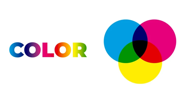
Color is never accidental in good design. Every color choice carries psychological weight. Red communicates urgency or passion. Blue builds trust. Green signals health or growth. Yellow grabs attention. Before you pick a palette, it helps to understand what colors actually do.
The Color Wheel and Harmony
The color wheel isn’t just art class nostalgia. It’s a practical tool. Here are the color relationships you need to know:
- Complementary colors sit opposite each other on the wheel (blue and orange). Use them for maximum contrast.
- Analogous colors sit next to each other (blue, teal, green). Use them for a cohesive, calm look.
- Triadic colors are evenly spaced in a triangle on the wheel. They’re vibrant and balanced at once.
Contrast and Accessibility
Your color choices need to be readable, not just pretty. Low contrast between text and background is one of the most common beginner mistakes. A general rule: dark text on a light background (or vice versa) is almost always safer than similar-value colors side by side. Tools like the WCAG contrast checker will tell you if you’ve crossed the line into unreadable territory.
Typography: How Type Speaks Without Saying a Word
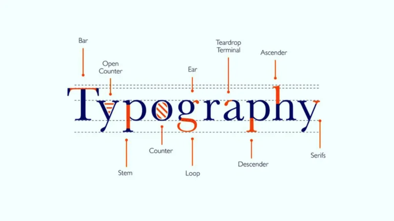
Typography is one of the most underrated fundamentals of graphic design. Most beginners pick a font they like and call it done. But experienced designers know that type choices communicate personality, hierarchy, and emotion — often before anyone reads a single word.
Typeface Categories You Should Know
- Serif fonts (like Times New Roman or Garamond) have small strokes at the ends of letters. They feel traditional, trustworthy, and literary.
- Sans-serif fonts (like Helvetica or Futura) are clean and modern. They’re widely used in tech and digital design.
- Display fonts are expressive and personality-driven. Use them for headlines only — never for body copy.
- Monospace fonts have equal spacing between characters. They’re used in code and tech contexts.
The Three Rules of Good Typography
- Limit your font choices. Two fonts — one for headings, one for body — is almost always enough. Three fonts is a maximum. More than that looks chaotic.
- Use size to create hierarchy. Headlines should be noticeably larger than subheadings, which should be noticeably larger than body text. Don’t be timid with the size difference.
- Mind your line spacing. Too tight and text is hard to read. Too loose and it loses cohesion. A line height of 1.5–1.8x your font size is a reliable starting point for body copy.
Layout, Grid, and the Art of Visual Organization
Layout is how you arrange all the elements in your design — images, text, white space, icons — so they work together as a whole. A great layout guides the eye naturally from the most important thing to the least important. A bad layout forces the viewer to do mental work just to understand what they’re looking at.
The Grid System
Professional designers use grids. A grid is an invisible framework of columns and rows that keeps everything aligned and consistent. It’s why certain designs feel immediately organized, even if you can’t explain why. Grid-based layouts create rhythm and predictability that the human eye finds instinctively comfortable.
You don’t need complex software to use a grid. Even a simple rule — like “all text starts at the same left margin” — can dramatically improve the tidiness of a design.
White Space Is Not Wasted Space
Beginners tend to fill every inch of their canvas. Don’t. White space (also called negative space) gives elements room to breathe and helps important content stand out. Some of the most effective designs in the world are mostly empty. Think Apple. Think luxury brands. Restraint is a skill.
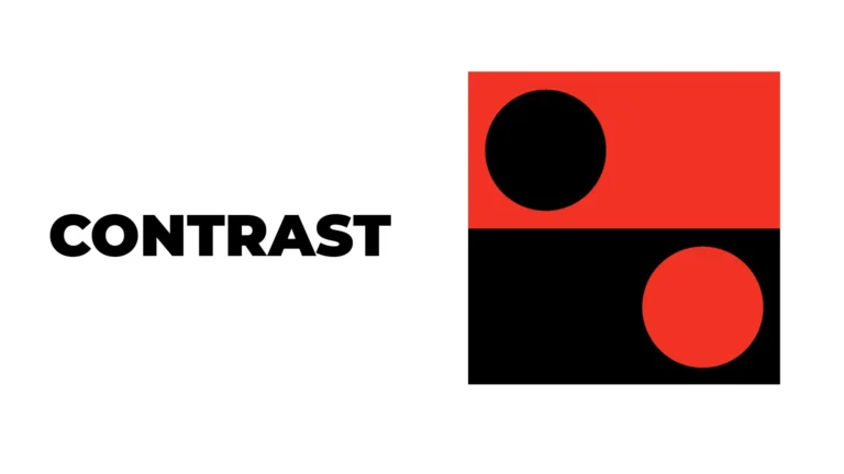
Balance, Contrast, and Emphasis: The Trio That Makes Designs Pop
These three principles work together to create visual impact.
Balance can be symmetrical (the same visual weight on both sides) or asymmetrical (different elements that still feel balanced). Neither is better — both are intentional choices. A centered design feels formal. An off-center design feels dynamic.
Contrast is what creates visual interest. Big vs. small. Dark vs. light. Thick vs. thin. Bold vs. delicate. Without contrast, everything competes equally for attention, and nothing wins.
Emphasis means deciding what the viewer should notice first. Every design needs a focal point — one element that anchors the whole composition. If everything is equally prominent, nothing is.
How Well-Structured Design Content Earns Visibility in AI Search
Here’s something designers and content creators are increasingly discovering: the same principles that make graphic design work — clarity, hierarchy, structure, context — are exactly what help content perform well in AI-powered search environments.
Understanding how AI search works reveals something important. Systems like Google AI Overviews, ChatGPT search, and Perplexity don’t just match keywords. They evaluate whether a piece of content genuinely answers a question with authority and depth. This is the heart of semantic search optimization — it’s not about stuffing terms; it’s about covering a topic comprehensively and logically.
For designers and creative educators writing about topics like the fundamentals of graphic design, this matters. AI content ranking factors in 2026 increasingly reward content that’s well-organized with clear headings, concise answers, and naturally varied language. A blog post with strong visual hierarchy — just like a well-designed page — signals credibility to AI readers and human readers alike.
Thinking about AI SEO strategies 2026 means understanding that structured, helpful, entity-rich content wins over keyword-stuffed walls of text. The future of SEO with AI is fundamentally about quality and clarity — values any graphic designer already understands intuitively. Content built with real expertise and logical flow will improve visibility in AI search because AI engines are increasingly good at recognizing the difference between genuine knowledge and hollow filler.
In other words: write like you design. With purpose. With hierarchy. With the reader’s experience at the center of every decision.
Putting the Fundamentals of Graphic Design Into Practice
Reading about design principles is step one. Applying them is where the real learning happens. Here’s how to build your skills from day one:
- Start with one principle at a time. Don’t try to master color, typography, and layout in one sitting. Spend a week paying close attention to just typography — notice what fonts brands use and why.
- Study designs you admire. Pick apart why they work. Can you identify the grid? The color harmony? The focal point? Reverse engineering teaches faster than any tutorial.
- Use free tools to practice. Canva, Figma (free tier), and Adobe Express let you experiment without any financial commitment. Constraints are actually great for learning.
- Give yourself briefs. Design a poster for a fictional event. Redesign a local business’s flyer. Constraints push creative thinking.
- Get feedback early and often. Share your work. Thick skin builds quickly, and so do your skills.
Final Thoughts: Design Is a Skill Anyone Can Build
The fundamentals of graphic design aren’t gatekept knowledge reserved for people with expensive degrees. They’re learnable, logical, and deeply rewarding to understand. Color theory, typography, layout, contrast, balance, hierarchy — these are tools available to anyone willing to pay attention and practice deliberately.
Whether you’re designing your first social media post, building a brand from scratch, or just trying to make your presentations look more professional, these principles are your foundation. Every confident, skilled designer you admire started exactly where you are now — confused, curious, and full of potential.
Start small. Study constantly. Design something today, even if it’s imperfect. The only way to get good at this is to do it.
Ready to take your Graphic Design to the next level?
Found this guide helpful? Share it with a fellow beginner, bookmark it for reference, or start experimenting with one principle today. The best design education is the one you practice.
Enquire Now